Showing posts with label comparison. Show all posts

Wednesday, October 26, 2011

OPI DS Glamour

I received such an awesome nail mail last night. When I saw my package waiting for me on my dining room table, I think I did a little polish dance!
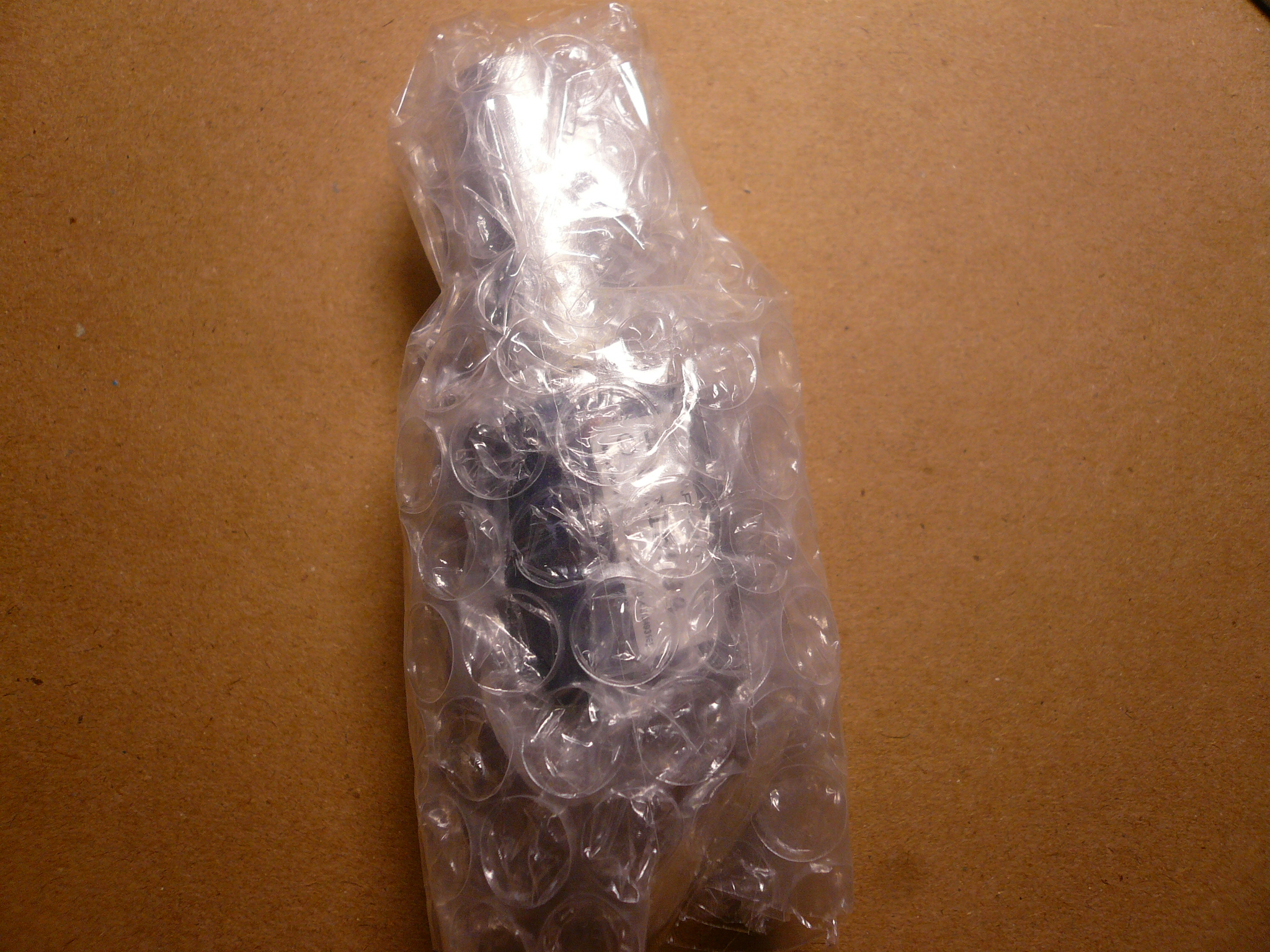
Couldn't wait to unwrap it! And I was a tiny bit worried it might break in the mail (yes, my polish has broke in the mail before, lucky I found out it was a fake OPI if I'd be even more sad), considering how much I paid for this baby. This is my most expensive polish to date, way more expensive than Chanel or MUS, simply because it's discontinued and super HTF. But after looking at the prices it was selling for on ebay, I think I got a good deal.

I finally managed to unwrap the bubble wrap without ripping it apart (I like to keep the bubble wrap)!
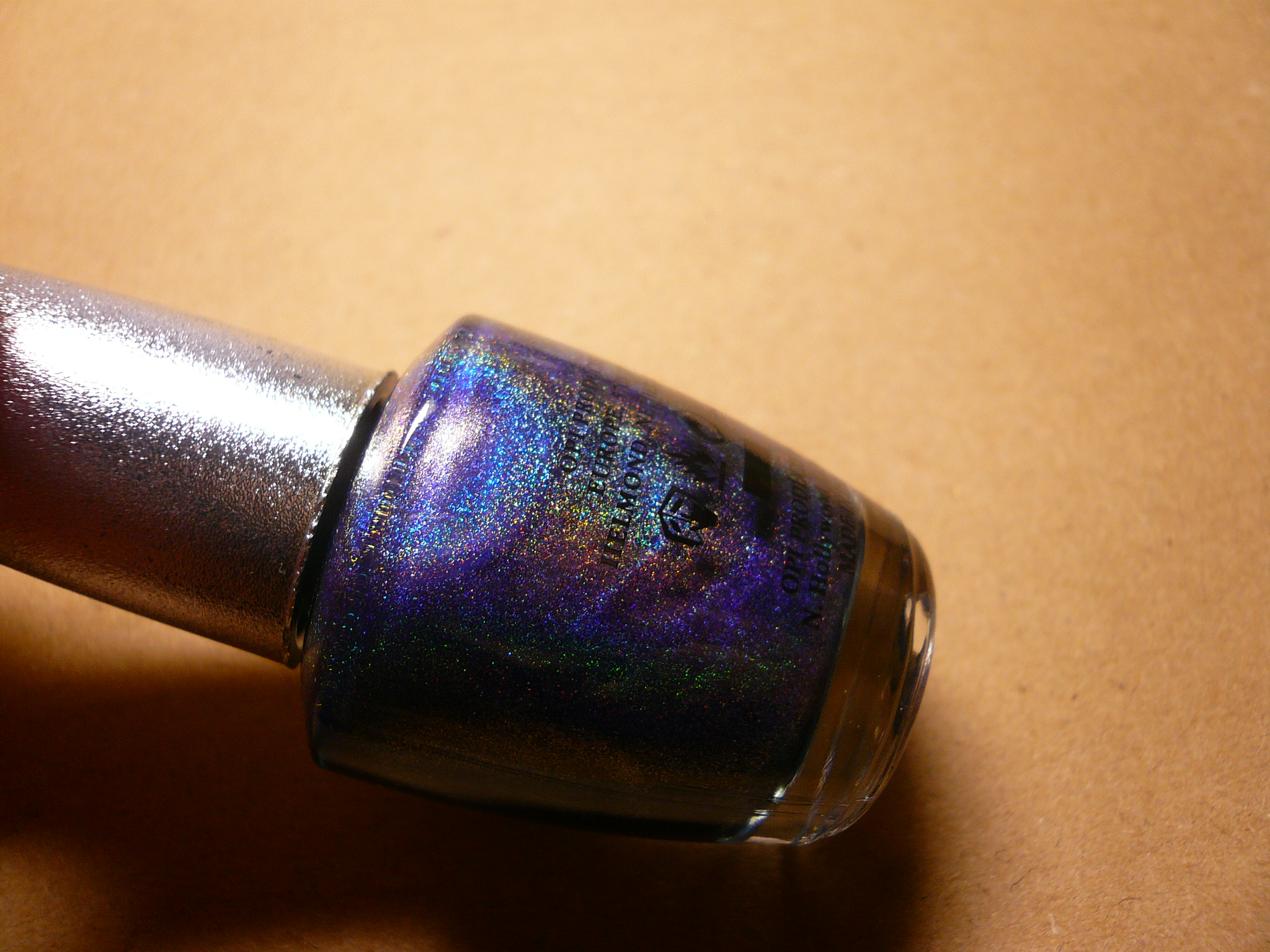
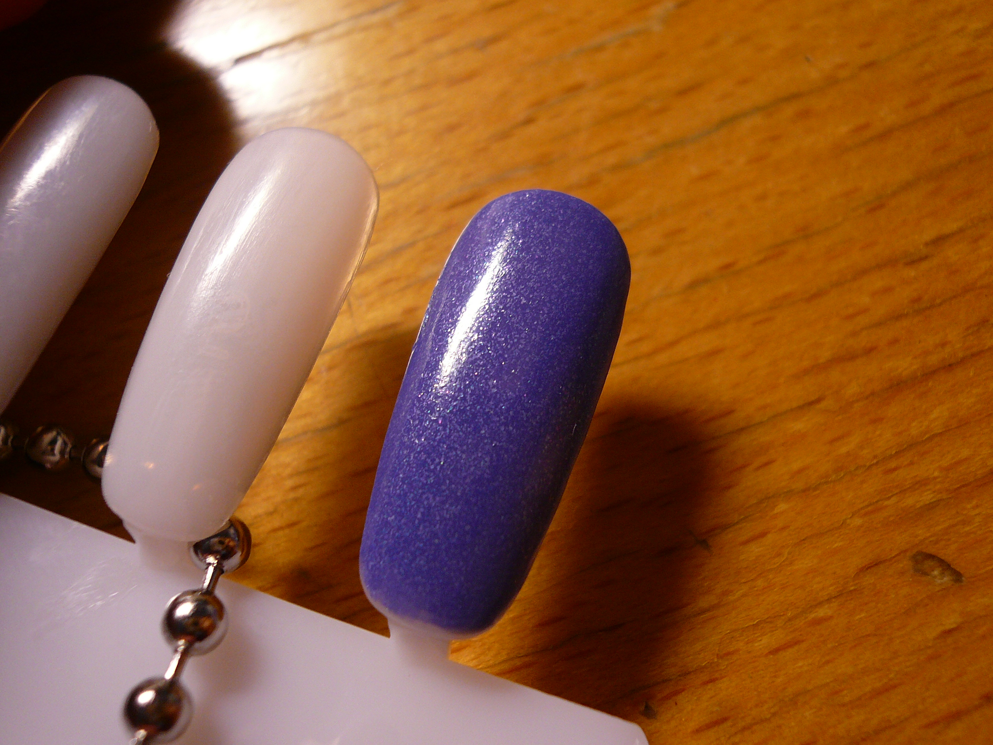
Look at this beauty! JOLIE! C'est belle! (Haha, I'm learning French now so might as well practice some vocab)

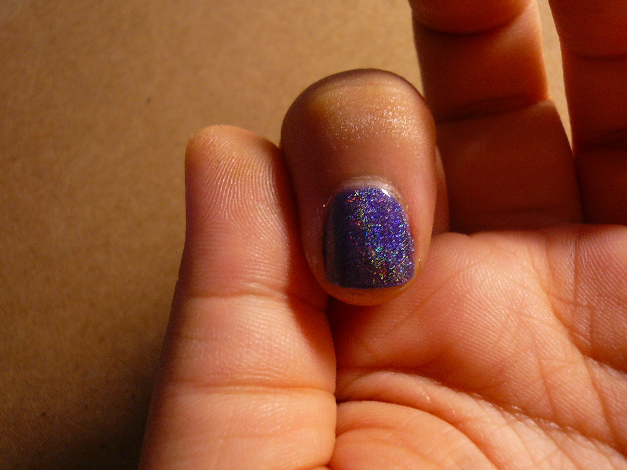
This picture was taken with flash to bring out the holo effect.

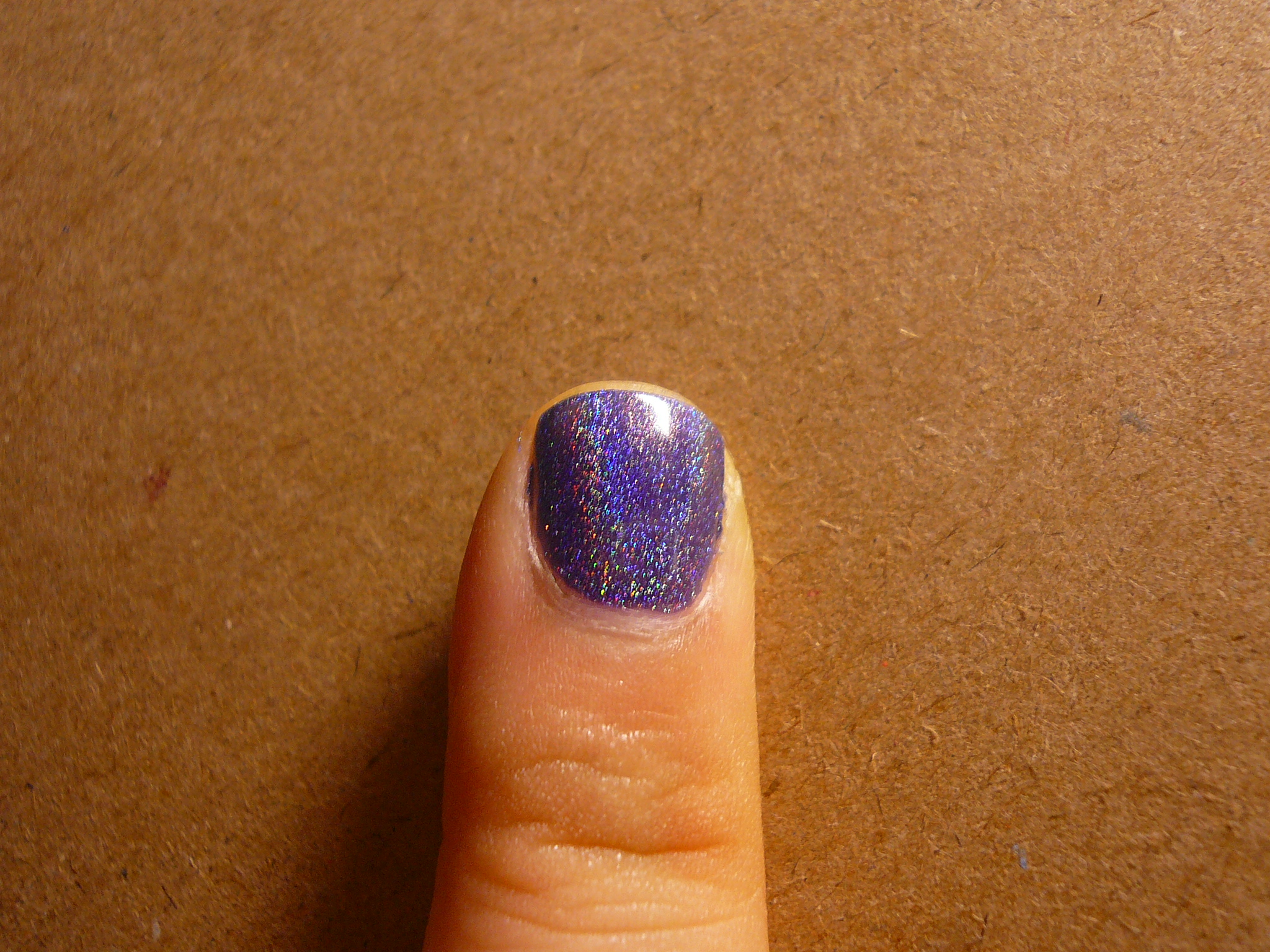
Since this polish cost so much, I didn't want to waste it by swatching all my fingers so I do apologize for only swatching one finger but let me make it up to you by showing you more pictures!
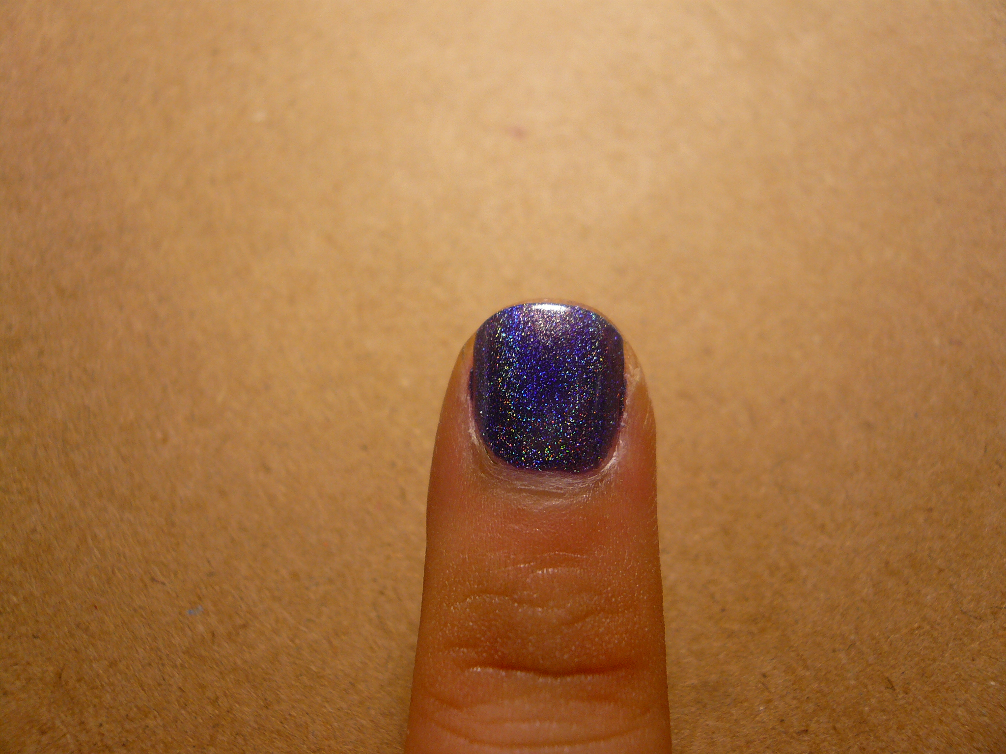
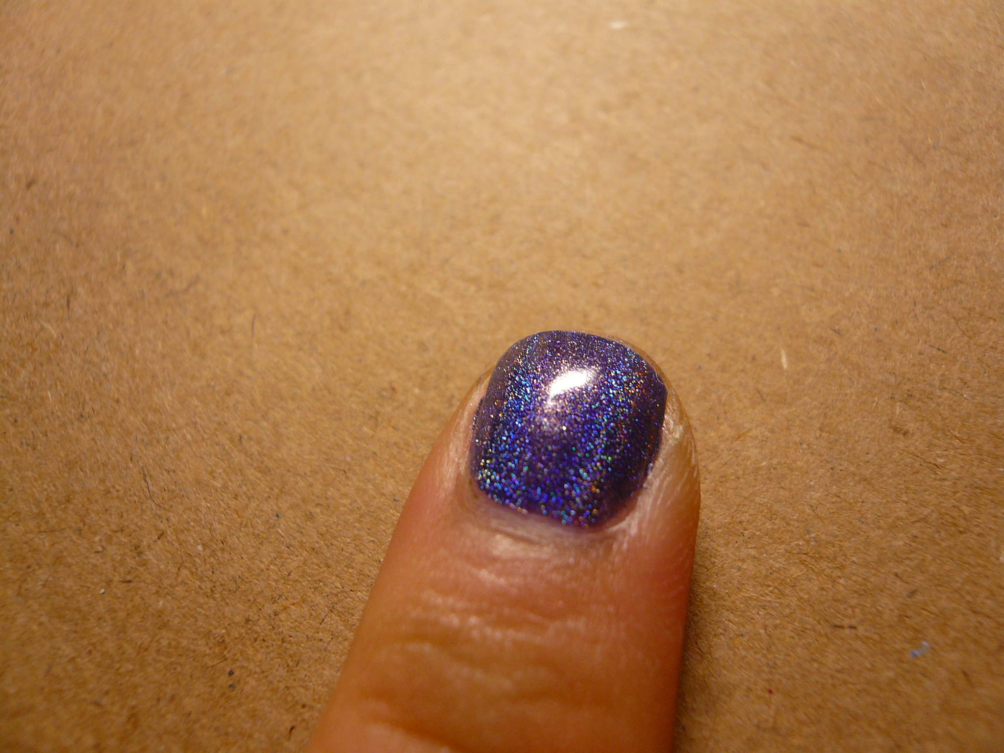
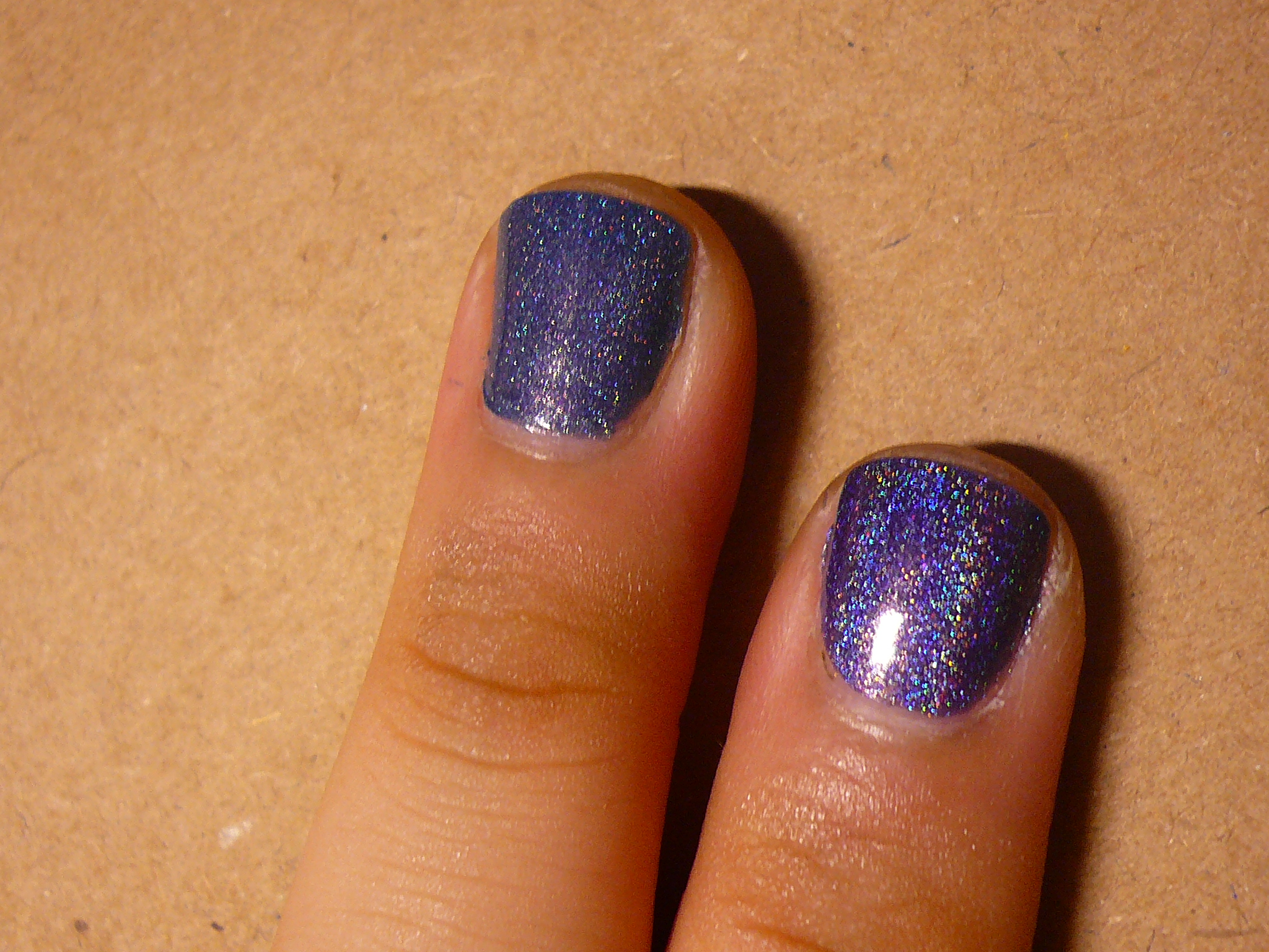
Remember my franken Glamazon? Here, I'm wearing Glamazon on my middle finger (left) and Glamour on my index finger (right).

Glamazon on top and Glamour at the bottom.

Glamazon on the left and Glamour on the right.

I was so in love with Glamazon but now that I have the real deal, Glamour is so much more, well, glamourous! The holoness is crazy pretty and although Glamazon by itself looked so fab, next to Glamour, it just paled in comparison. I'm thinking of adding some spectraflair into Glamazon once it arrives to spruce it up a little!

I am such a happy bunny (just picture Happy Bunny minus all the sarcasm) now that I actually own DS Glamour. Whoooo. My drawer full of blues will definitely welcome it into the Helmer family! Merci beaucoup to the two wonderful girls from inkypolisholicious for helping me to lay my polished paws on DS Glamour!

Wednesday, August 3, 2011

Essie Smooth Sailing

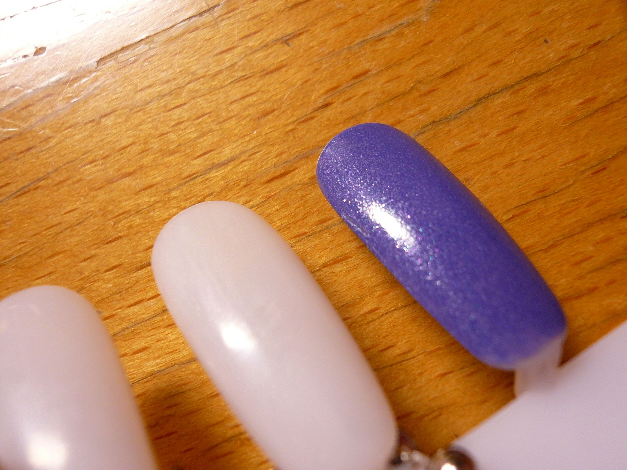
My darling polish sister S (initials only! Because we're fab like S and B from Gossip Girl!) got Essie Smooth Sailing from the last polish spree and she graceously allowed me to swatch it on before passing it to her. Being a good polish sister, I only swatched it on one nail and on my nail plate (didn't want to be too greedy as I already felt guilty swatching one nail) and decided to do a comparison with my other periwinkle polishes!

Bottle pics first, as usual. here you can see how Smooth Sailing (all the way on the right) is much more purple than the rest! L-R: Orly Snowcone (the bluest of them all), Essie Lapis of Luxury, China Glaze Secret Periwinkle, Etude House BL505 and last but not least, Essie Smooth Sailing.

A lone bottle shot. Smooth Sailing in its entire glory. It's gorgeous! It's a deepest periwinkle with such subtle blue and purple shimmer. Totally reminds me of royalty! I'm so in love with it that if I were to get married tomorrow, this would be my something blue!

I decided to compare Smooth Sailing with Lapis of Luxury (it's Essie sister) and China Glaze Periwinkle (because it's the next most purple out of the bunch). Those two polishes are also the mroe popular ones compared to the rest so more people will have them and can get a more solid idea of how Smooth Sailing looks like! L-R: Smooth Sailing (2 coats), Secret Periwinkle (2 coats) and Lapis of Luxury (3 thin coats).

The shimmer in Smooth Sailing does look a bit flat in pictures but it does pop a little but more in real life! I think the shimmer shines a little but more in the picture below.

Here are the nail plate shots. Do click on the pictures to enlarge them so you can see the shimmer particles better!

Smooth Sailing is a little deeper than my pictures show. I think this (click click!) is the most accurate swatch online so far, or at least it looks like the most accurate on my screen! I can't seem to upload the picture so just click on the link to view it okay?

I think I'm in love. I haven't felt like this for a polish in a very long time. Dammit, just when I needed to ban myself from getting more polishes!


Saturday, June 18, 2011

OPI Stranger Tides

Recently got OPI Stranger Tides from nailvibe since they were offering a 10% off (with min $50 purchase). This is the last of the OPI Pirates polishes I got because I wasn't interested in the two pinks and the grey. I've been lemming for Stranger Tides ever since I swatched it on my thumb at BHG, even though I already have Essie Da Bush (which is a very close dupe). So if you've been wondering how much they look alike, look no further!

Before any pictures, let me just tell you what's on my digits so I won't have to repeat myself for every picture! All pictures were taken under indirect sunlight and without flash.

Index: OPI Stranger Tides

Middle: Essie Da Bush

Ring: OPI Stranger Tides

Pinkie: Essie Da Bush

This is one coat and it's really hard to tell the two colours apart.

Here they are with two coats and immediately you can start to see that Stranger Tides looks more yellow and Da Bush looks more blue. Da Bush was pretty opaque upon the second coat but Stranger Tides had some bald spots so I had to do a third coat. I feel that with shades prone to bald spots (perhaps due to the fact that they're not as pigmented), painting with lighter strokes helps. That way, the brush doesn't press too hard on the polish and create bald spots. Lighter strokes with a little more polish on the brush!

Even though Da Bush didn't need a third coat, I still painted it on for comparison sake. With a third coat, Stranger Tide is now fully opaque sans any bald spots. I must say that even though Stranger Tides required three coats, they were very easy to paint on because of the pro-wide brush as well as the formula of the polish. It wasn't too thin (ahem, Essie Turquoise and Caicos, I'm talking about you) nor too thick. Da Bush also had a nice formula and was also easy to paint on.

Here's a bottle shot! Da Bush on the left and Stranger Tides on the right.

I find that recently with Essies, their formulas have either been a hit or a miss. Take for example Mint Candy Apple, Eternal Optimist and Borrowed and Blue. From my experience, even these three colours were rather pigmented and only required two coats, they were pretty thick and hard to control, which resulted in ugly brush strokes or flooding of the cuticles. So kudos to Essie for getting Da Bush's formula just right!

I also asked my mum if she could see a difference between the two shade and she honestly couldn't tell that Stranger Tides has a yellow undertone compared to Da Bush's blue undertone. She only said that Stranger Tides looked lighter than Da Brush but the difference was so minute she started nagging me about wasting money on polishes again. So verdict wise, like I always say, unless you're crazy like me, or you love colours like these or a back up of sorts, you really don't need both. Personally, I do see a difference and do not regret getting both but when it comes down to actually wearing them and deciding which one to use, I'll probably just flip a coin cuz they're pretty much similar.

Tuesday, June 14, 2011

OPI Planks A Lot

First of the OPI Pirates of the Caribbean collection comparisons is Planks A Lot, a dustly purple.

Here, we have Planks A Lot with its other OPI cousins!

From L-R: Parlez-Vous OPI?, Planks A Lot and Done Out In Deco.

They'll all so different but you can still somehow see a common thread running through them right? All three of them are dusty and a dream to apply. 2 coats each if I recall correctly.

Regardless, all three of them are gorgeous and are VERY different so if you are a fan of shades like these, they're all must-gets! OPI Parlez-Vous OPI? is a discontinued colour but it should still be relatively easy to find on Ebay!

Sunday, March 27, 2011

Purple Power

8th comparison post of the series! Lucky number 8!

Here we have (from top to bottom) OPI Done Out In Deco, TFS PP408, Done Out In Deco and OPI Parlez-Vous OPI?

(L-R) OPI Done Out In Deco, TFS PP408, Done Out In Deco and OPI Parlez-Vous OPI?

L-R: OPI Parlez-Vous OPI?, OPI Done Out In Deco, TFS PP408 and Done Out In Deco

The first 2 pictures were taken under my lamp and the last picture was taken with flash. Both the OPI colours needed 2 coats while the TFS polish needed 3 coats for opacity.

As you cans see, the TFS polish was close to Done Out In Deco but it was much brighter and redder. Done Out In Deco, on the other hand, was bluer and dustier. Of course, the dustiest of the bunch was Parlez-Vous OPI? and it was also the darkest among the three. I'd say that Parlez-Vous OPI? is Done Out In Deco's darker cousin because they're both in the dusty purple family.

Hope you like the purples! They're such a fresh colour to rock! :D

Thursday, March 24, 2011

Dark Shimmers

Time for the 7th comparison of the series! Wow, never knew I had this many polishes that were close enough to do comparisons! =/

Today, we have Misa Dying Love, Misa It's You and TFS BK901 in the spotlight. All three of them are dark (almost black) polishes with some form of shimmer or fine glitter that makes them more interesting than your normal black polish.

Dying Love is a black-based polish with silver/grey shimmer and it applied very well. It's You is more charcoal-based with a duochrome purple and green shimmer. TFS BK901 is similar to It's You except it's black-based and it has duochrome purple and green (tiny) glitter particles. All 3 polishes needed 2 coats to be opaque.

L-R: Misa Dying Love, Misa It's You and TFS BK901. Here you can see the various glitter/shimmer finishes of the three polishes.

L-R: TFS BK901, Misa It's You and Misa Dying Love

L-R: Misa Dying Love, Misa It's You and TFS BK901

TFS BK901 and hopefully you can see both the purple and green glitter a little better in this picture!

Honestly, you can only see the shimmer/glitter in Dying Love and BK901 under strong sunlight or with flash (if you're taking a picture) so effectively, they both look like black polish indoors. It's You were a little more in-yer-face with it's duochrome shimmer so if you're going for a more obvious effect, then I suggest you choose It's You among the three.

I actually love how BK901 looks so intergalectic. It's very space-age and gives of a really cool looking effect! All in all, I really like the overall glitter/shimmer addition to the polishes. It would have been so boring if it were just the base colours but the shimmer/glitter livens up  the polishes!

Friday, March 18, 2011

The Beiges

Comparison #4!!

My good friend bought OPI Bare It In Trafalgar Square quite a while back from eBay and when she gave me a swatch of it, I loved how it looked so much, I knew I just had to have it! Mind you this swatch was one stroke of polish on a scotch tape. That was how much it drove me crazy. That one thin strip of beige was so alluring!

Left to right: OPI Bare It In Trafalgar Sqaure (BIITS), Essie Jazz and Elianto Eggshell, taken under a lamp.

Same order, taken in indirect sunlight. Colours are more accurate in this picture!

Taken with flash.

So I did a comparison previously between Jazz and Eggshell and I concluded that they were dupes of each other (with one eye closed). However, I do not have any dupes for BIITS in my collection because it's far whiter than any of the close colours I have. It did look pretty close to Jazz in the bottle though!

All three of the polishes took 2 coats to be opaque although Jazz was a little more sheer than the other 2 so for people who are very particular about VNL, 3 coats would be best! I'm actually very impress with how opaque BIITS was! I was expecting it to be sheer and was prepared to do 3-4 coats but it's very opaque, even with the first coat on! Maybe it's got to do with the fact that it's a black label (old OPI that isn't Big 3-free).   

Really loving all three of these colours and I think I may be wearing these for the first few days of my internship, to check out how conservative my office is (as well as the clients' offices)! I love how these colours looks so chic on short nails and they makes them look very neat and clean cut! (: 


Saturday, February 26, 2011

Essie Merino Cool vs Rimmel Beige Babe

Essie Merino Cool is on my middle finger and Rimmel Beige Babe is on my index finger.

Under a lamp.


 With flash. (Please ignore the "low quality" words on the left! I was doing my Marketing notes while painting my nails. Or was it the other way round? Haha!)

As you can see, Merino Cool is lighter and also more purple than Beige Babe. To be honest, when I bought OPI Parlez-Vous OPI?, I was kind of expecting it to look like Merino Cool.

I painted 3 coats for both polish but I guess you could get away with 2 coats. I think it was because I was painting my right hand which was why I went thinner on the coats. I tend to do 3 thin coats for my right hand and 2 thicker coats for my left hand!

Really like Merino Cool A LOT in terms of both its colour and formula! It's a great purple taupe polish!


Sunday, February 20, 2011

OPI Hey! Get in Lime

Soooo, I managed to get my hands on another bottle of OPI Hey! Get in Lime after my first bottle broke in the mail. Bought it from a different seller which might explain what I'm going to tell you.

The two bottles are different in colour! I know it's common for some OPI polishes to differ in colour (a la My Private Jet, which God knows how many versions are out there) but I believe Hey! Get in Lime (HGIL) wasn't sold for a long time right? It is discontinued afterall.

The new HGIL is painted on my index and ring fingers, while the old one is painted on my middle and pinkie fingers. Can you see the (very) slight difference between them two? The new one is much more yellow-based and duller while the other one is definitely bluer and brighter! Excuse the knicks on my nails, I thought my nails were dry enough to play the guitar. Apparently they weren't.

This is with flash!

I was kinda bummed out when I first got the new HGIL because I loved the first one so much but but but, I wore the two colours for an entire day and I'm kinda liking the new one now! My mum says the new one is nicer while my brother said the old one is nicer, so still, I'm kinda split between the two. I guess I like them both!

What say you?

Thursday, January 27, 2011

Broken

I was way excited when my mum texted me yesterday during my lecture telling me that my polishes had arrived! And then as I read on, I got super sad. Why? See for yourself!

One of my bottles broke in the mail and spilled all over the place!  

The culprit: OPI Hey! Get in Lime broke at its neck and caused a massive mess. I was really looking forward to painting my nails with it but looks like it ain't happening any time soon. My nails are really jealous of the bubble wrap because the bubble wrap had the pleasure of being coated in the polish and my nails didn't. The green is beyond amazing as it's really nice and dreamy. I'm super bummed out this happened because it was damn hard to find this bottle and I was beyond amazed when the girl told me she could help me get it! Anyways, I emailed the girl these pictures and she was nice enough to give me a refund. 

I did however, manage to salvage just enough polish to do this comparison:

3 coats each, Hey! Get in Lime on the left and The Face Shop G503 on the right. TFS polish applied more streaky but it was still acceptable. I guess that's why OPI costs more, for its superb formula! Comparing the 2 colours, I honestly didn't expect them to be this similar when I ordered the OPI. I think if I'm desperate enough, I can always add in a few drops of blue into my face shop polish and franken the hell out of it to give me a similar shade as the OPI. Shouldn't be that hard to do!

I just hope the girl I ordered the OPI from will open up a new pre-order so I can order it again! I would happily pay $12 to get the OPI, hopefully in one piece next time!