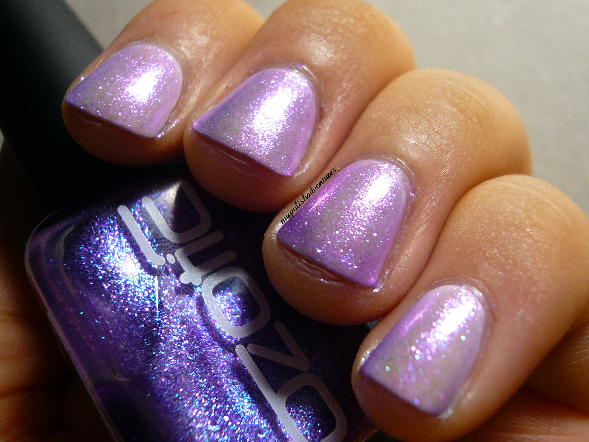
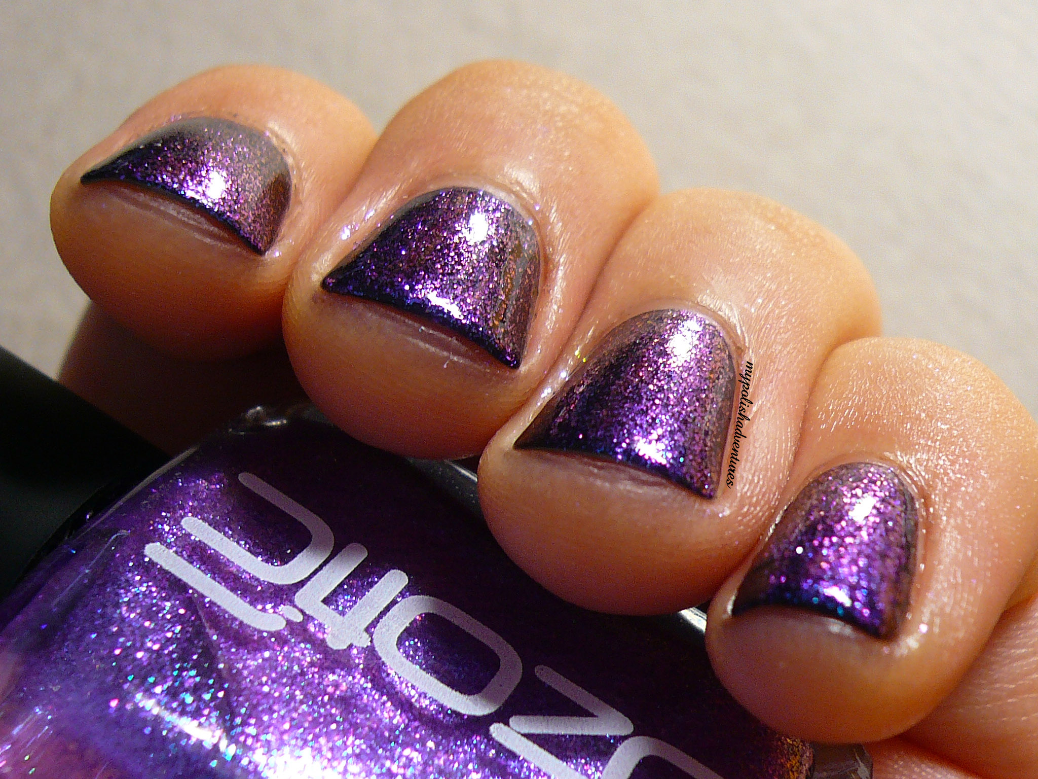
902 appears purple with just a little more! This is 4 thin coats on its own.
You can see there's a duochrome finish to it. On its own, it shifts from a overcast grey to purple, with pretty blue flecks shinning through.
You can also layer 902 over white, to get a pretty, pale lavender look. This is two coats of 902 over white.
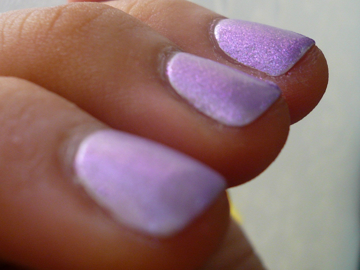
Layering it over white makes me think of fairy wings! It just looks so precious!
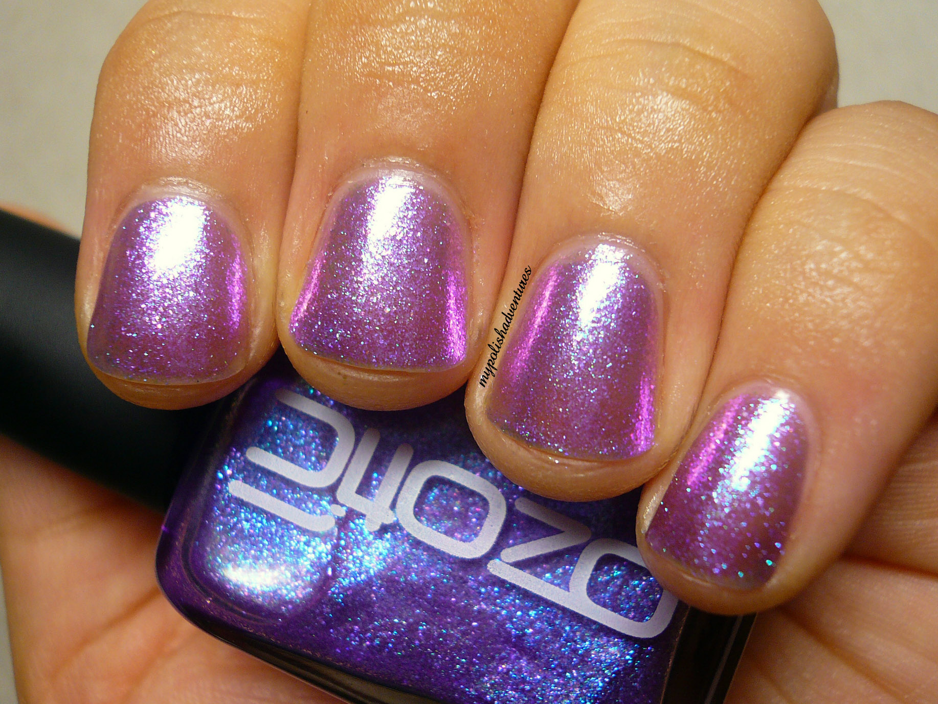
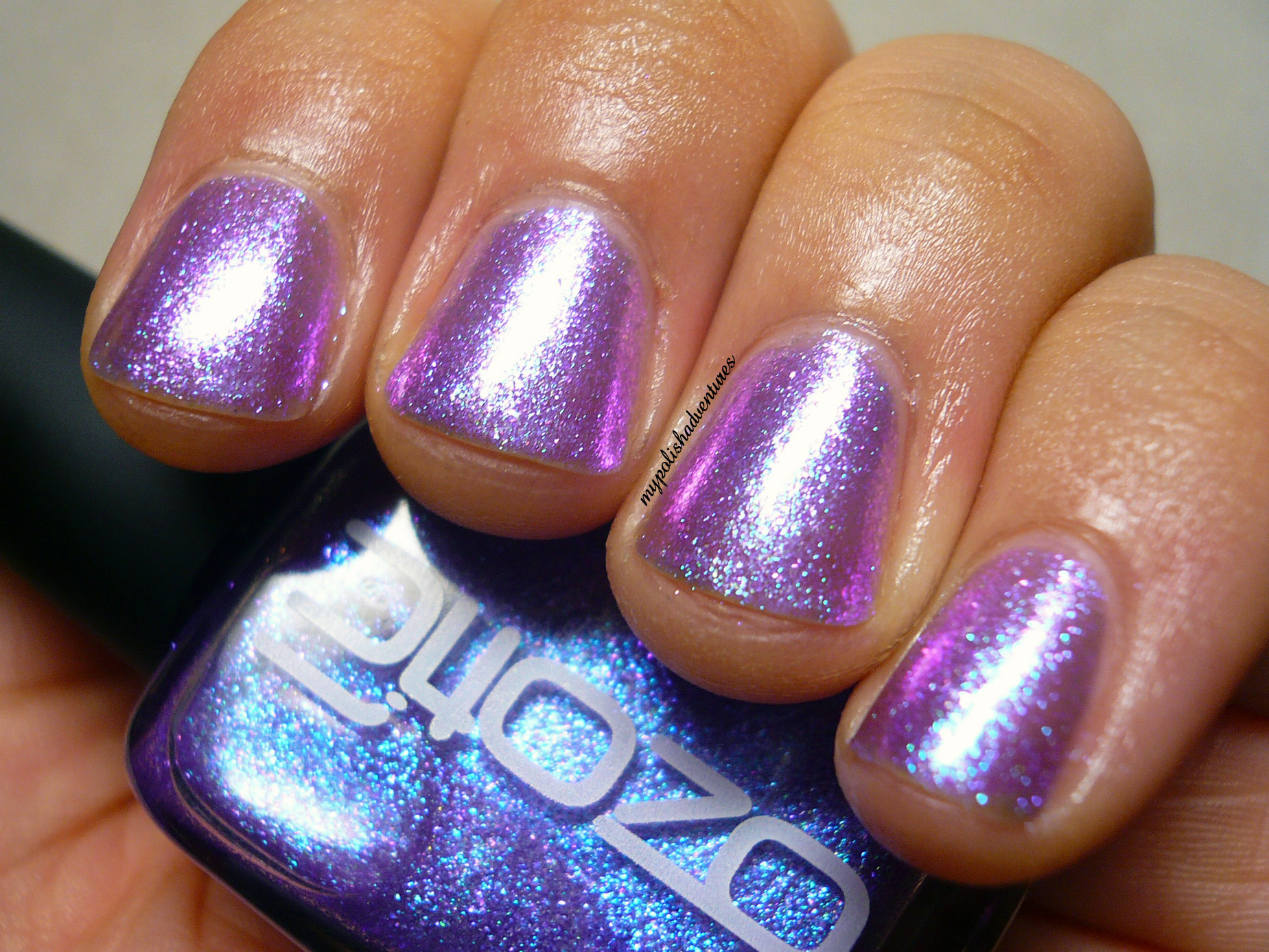
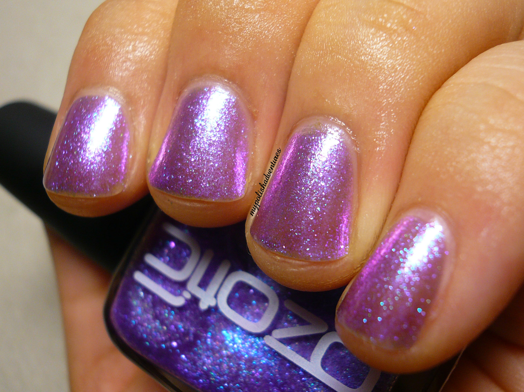
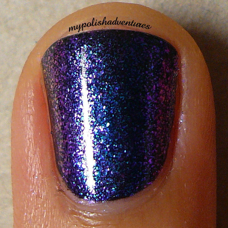
One last look you've got to check out (and try!) is how 902 looks over a black base. This is one coat of 902 over black.
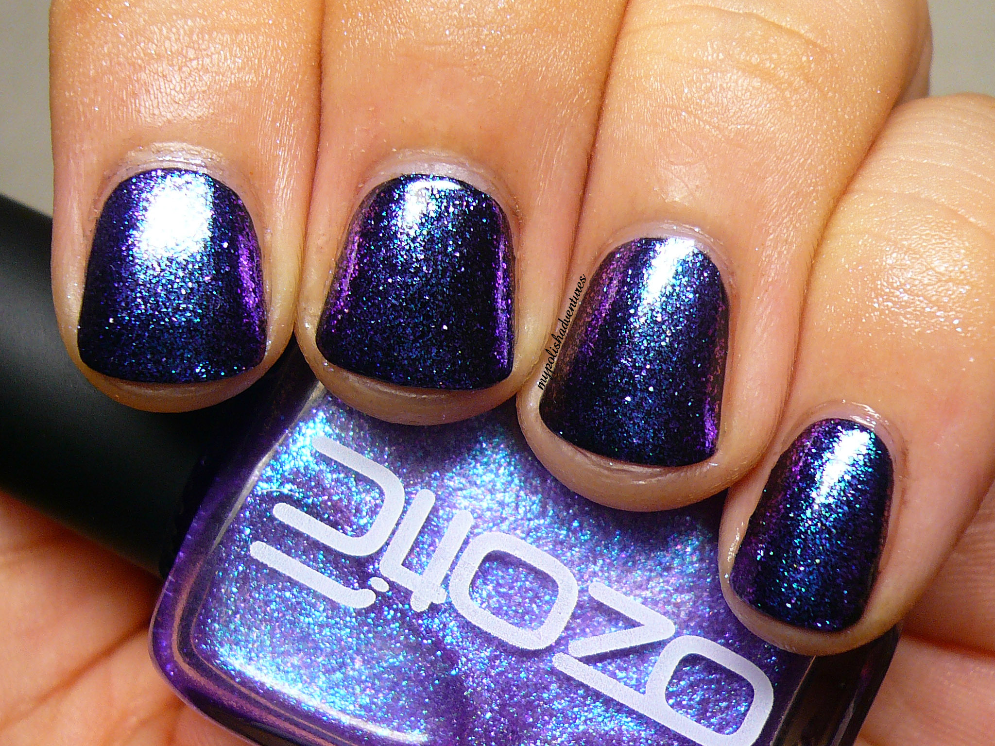
Isn't 902 just GORGEOUS over black? The blue flecks stand out so much more!
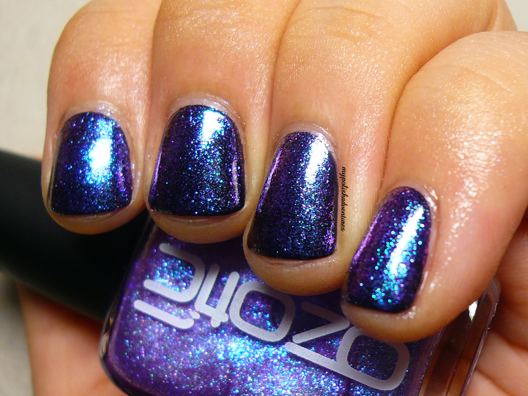
And here you can see the prominent blue to purple shift.
At extreme angles, you can even catch a little hint of amber in the colour shift!
It's a magical transformation that you need to see to believe!
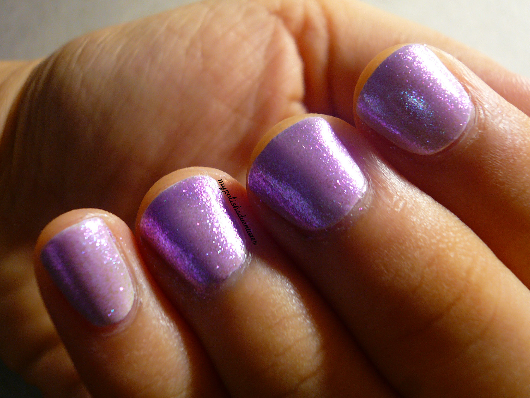
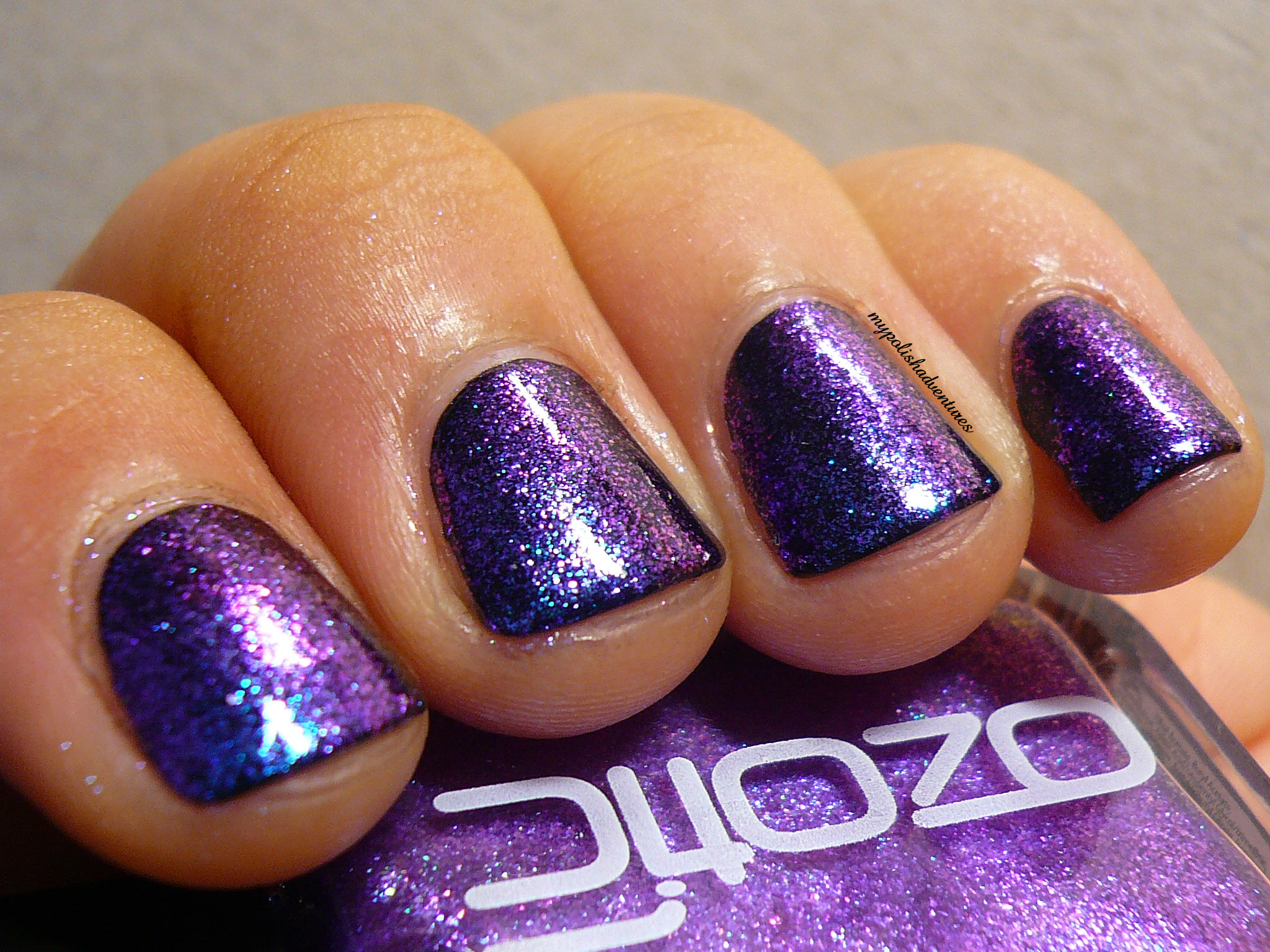
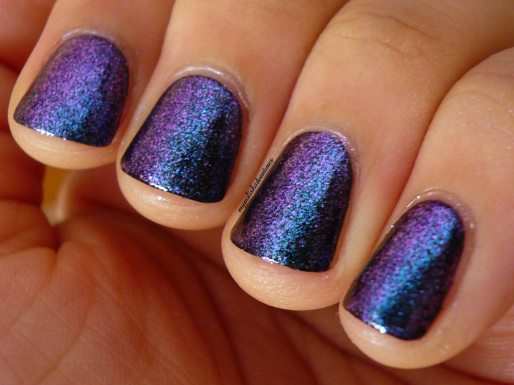
I couldn't resist some macro shots! I mean, just look at the colour shift!!! As usual, Ozotic's duochromes/multichromes never disappoint!

Here's a shot taken indoors, under no direct lighting, not near any windows, just a random spot in my room. It only goes to show the polish shines even when it's not under strong lighting!
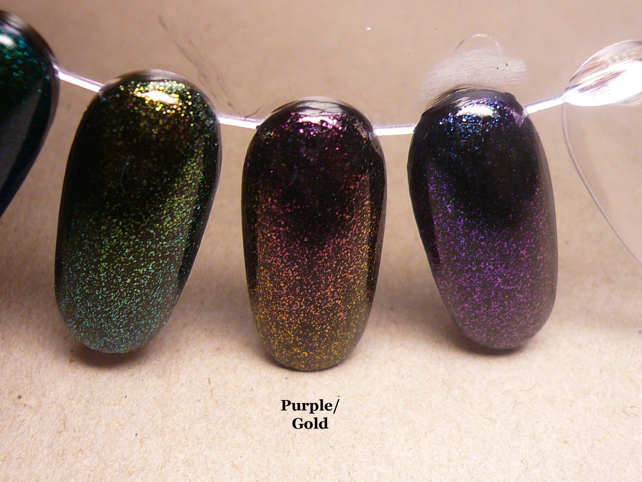
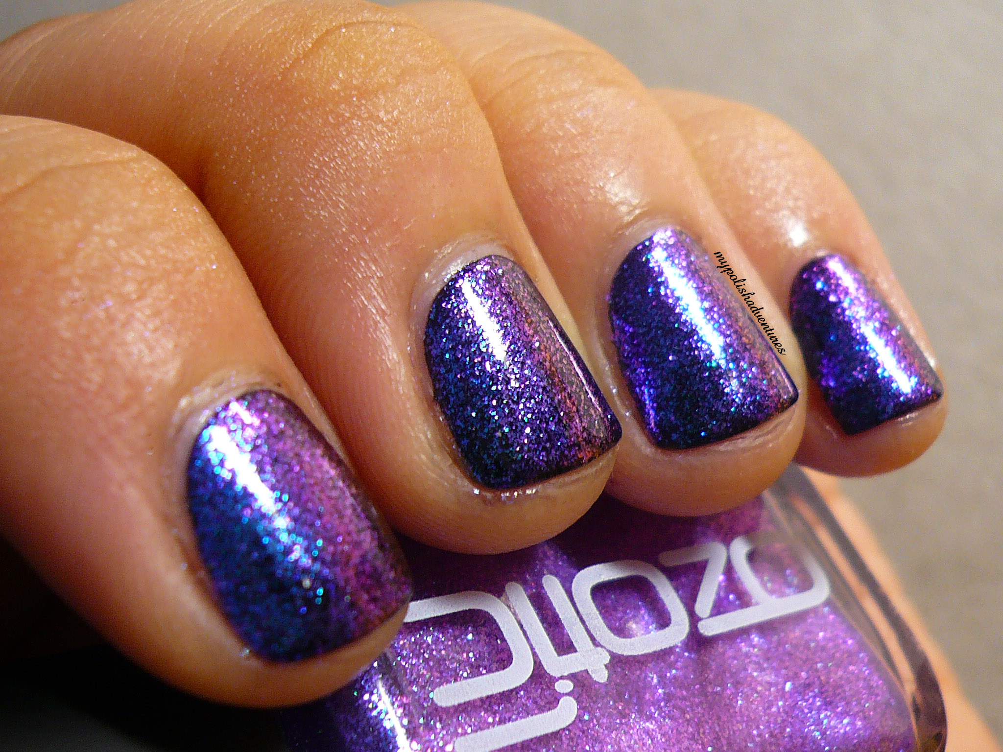
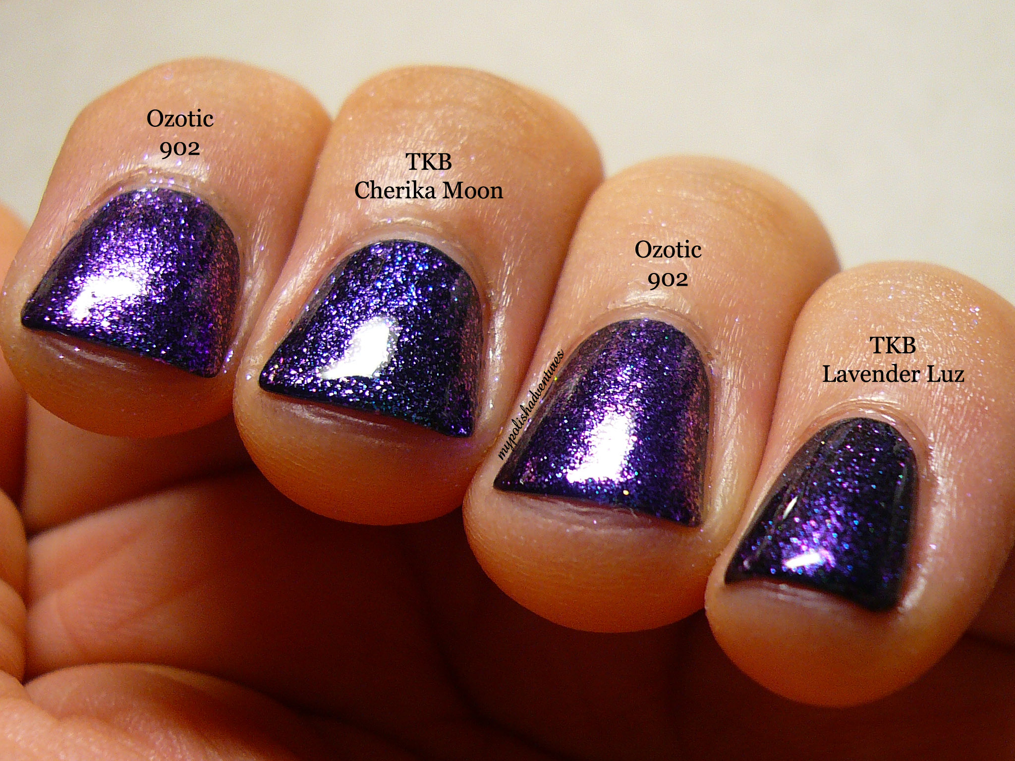
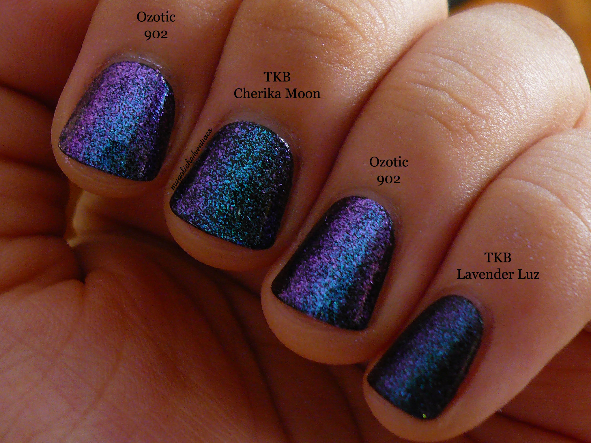
The moment I painted 902 over black, I knew it looks familiar and I dug out two of my frankens made from adding TKB pigments into clear polish.
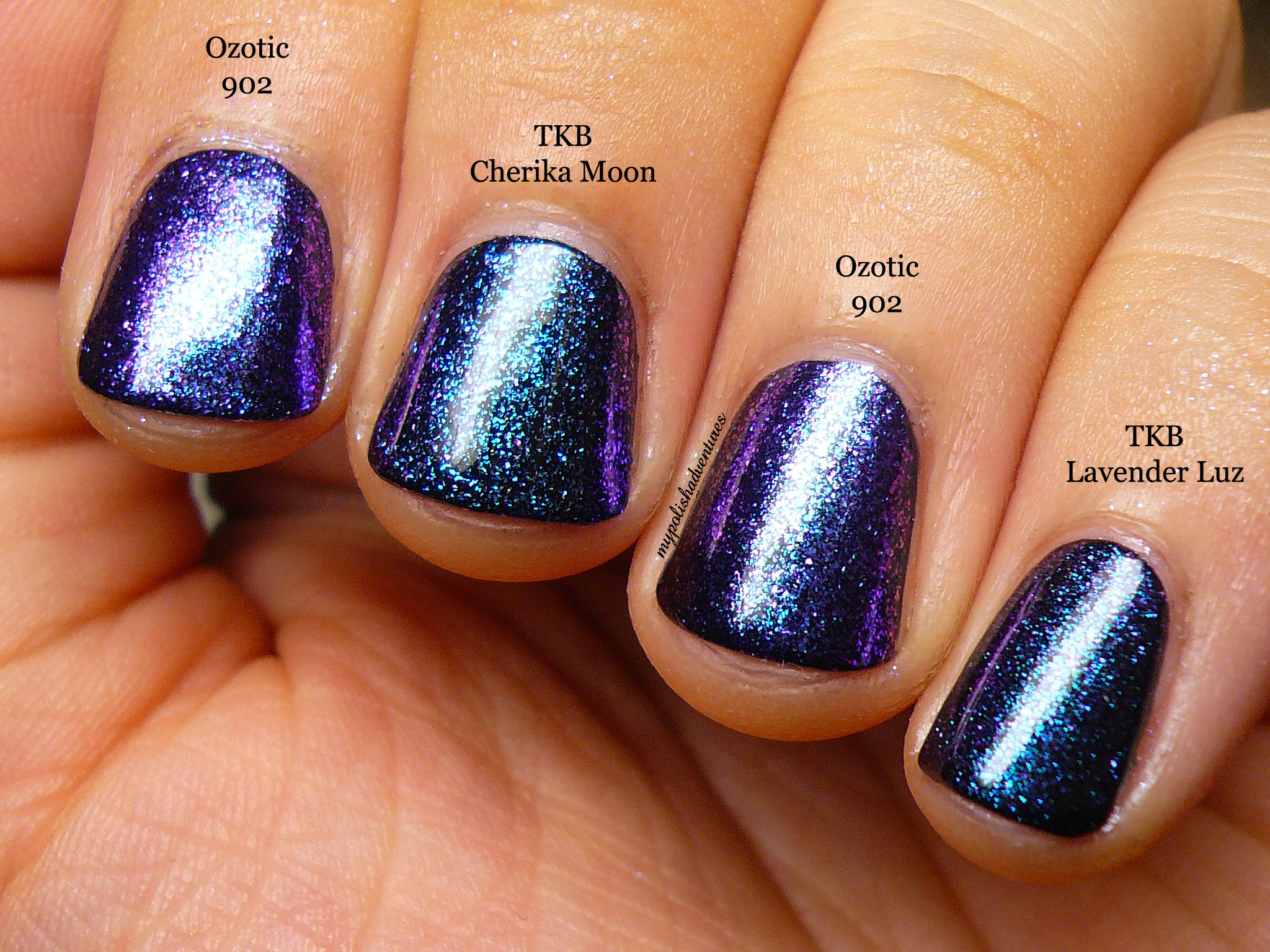
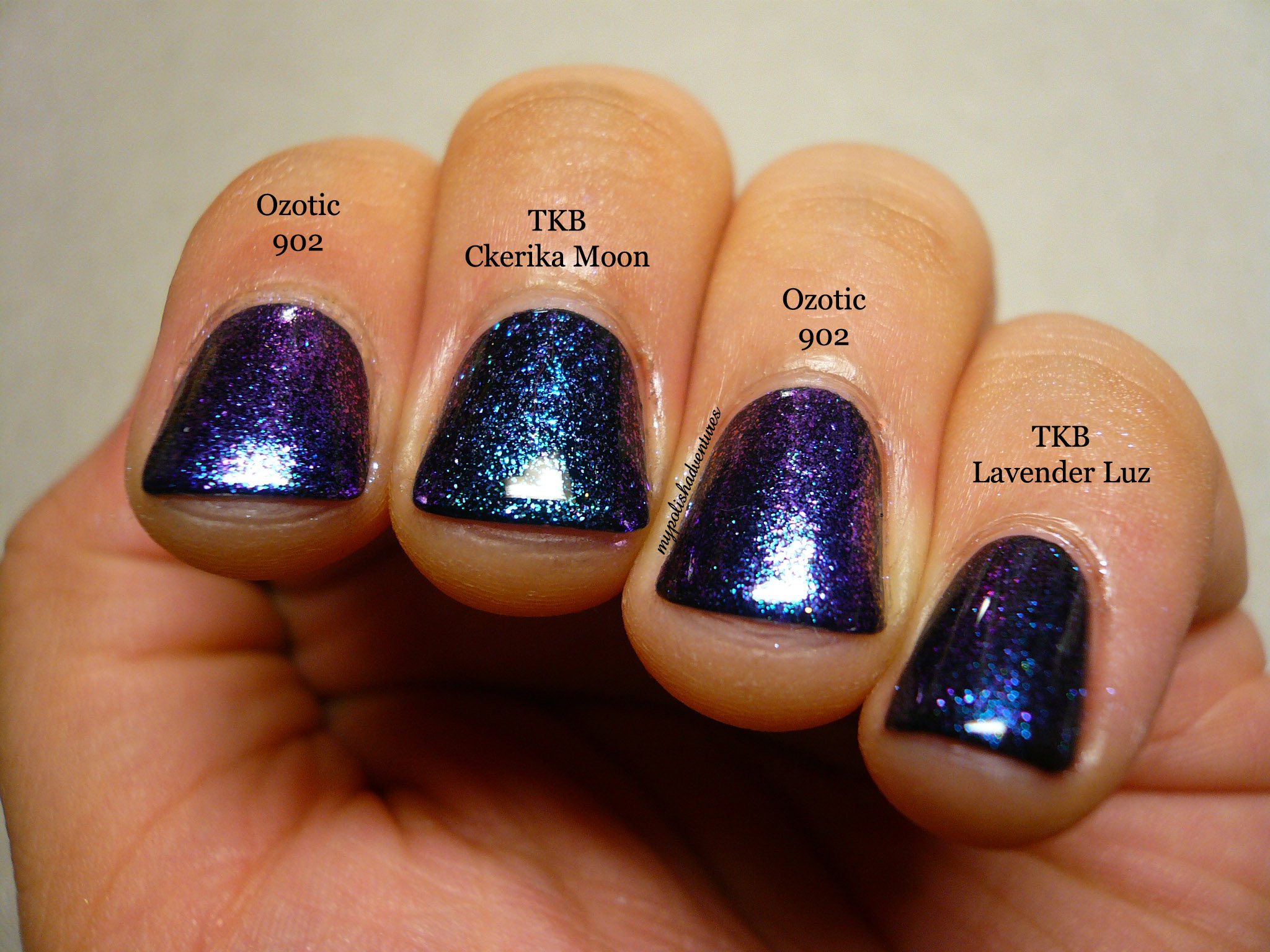
As you can see, my two frankens are pretty similar to 902 but they aren't dupes at all! TKB Cherika Moon has more teal and less purple to it and TKB Lavender Luz has more of a finer, shimmery appearance, compared to the glass fleck appearance of Ozotic 902.
I also needed two coats of my franken over black vs the one coat of 902 I used over black, so you know how densely packed 902 is with those magical glass flecks!
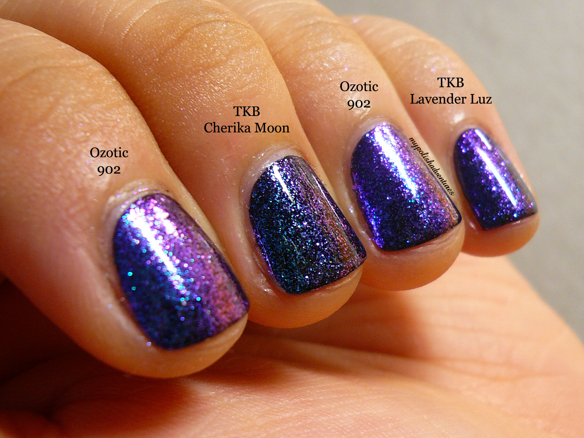
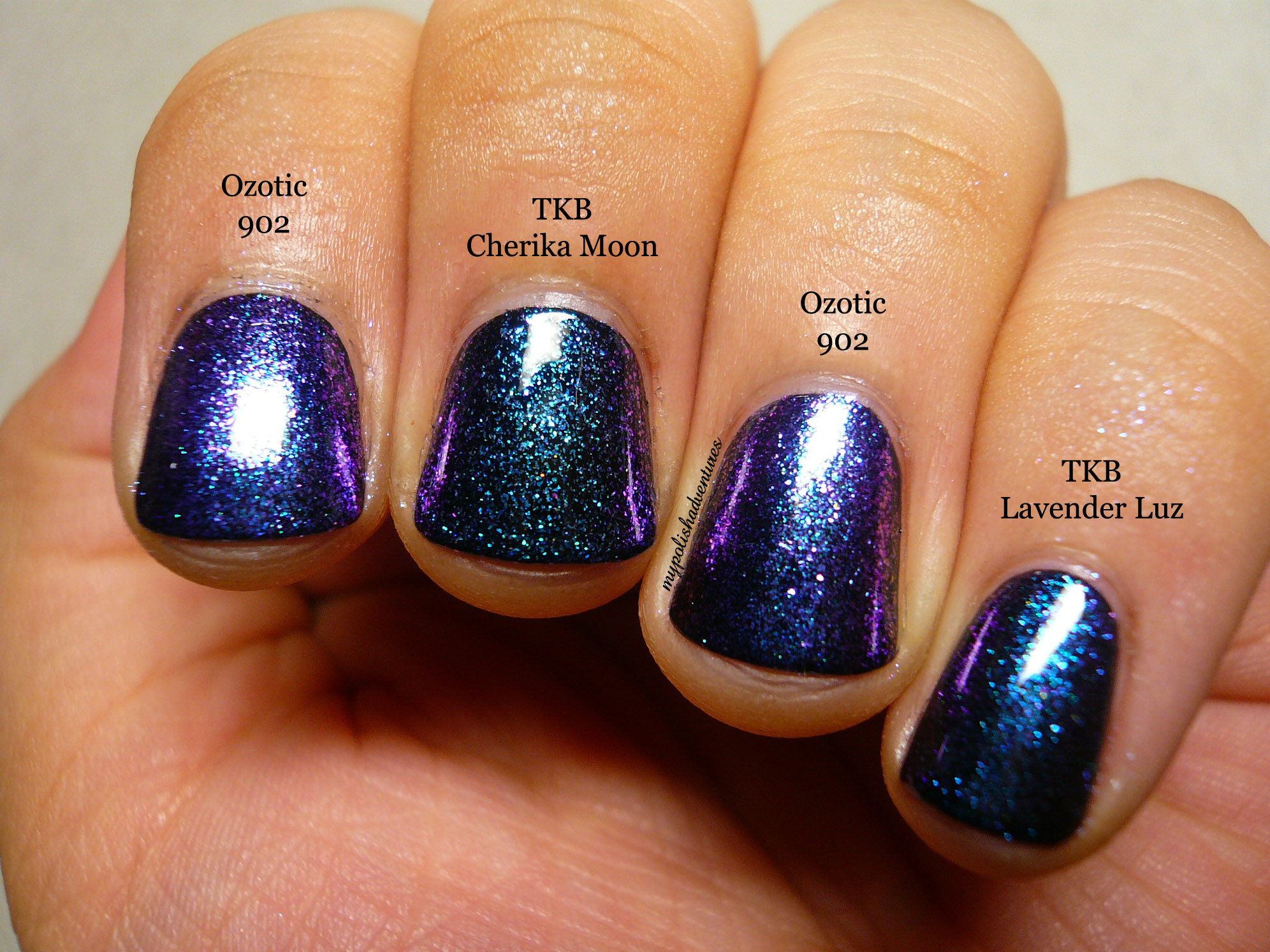
Here's one last shot of the three polishes, again taken in the same random spot with no direct lighting. Boy, the colour shift really looks so pretty!
The formula of 902 was amazing and it was really easy to get an even coat of polish when painted on its own or over black. When painted over white, it was a tiny bit harder to get an even coat but it wasn't impossible. You just have to get the right amount of polish on the brush.
The dry time was also good and they were dry to the touch in under ten minutes. That's pretty awesome considering I had a minimum of 3 coats of polish on my nails.
--------------
There are three other shades to the Sugar range and another four shades to the Beam range (that were inspired by reflecting luminous light beams), both of which were just launched on the piCture pOlish facebook page a couple of days ago. Morenailpolish has amazing swatches of all eight of the new shades so go check them out as well!
Both the Sugar and Beam ranges are now available on piCture pOlish and Star Trinkets.
Disclaimer: This product was sent to me for my honest opinions. I am not affiliated with Star Trinkets or piCture pOlish.